
Hot summer days
Summary
In Portland we recently broke the record for number of days above 90 F in a year (with 30 in 2018, as of August 21st) (https://twitter.com/NWSPortland/status/1032384600696213504). I wanted to visualize whether this sustained heat really was unusual, or if I were falling for recency bias. I remembered an article from the New York Times that visualized Steph Curry’s 3-point shooting 2015-2016 NBA season in an interesting way, showing the cumulative sum of three pointers made over the course of the season (https://www.nytimes.com/interactive/2016/04/16/upshot/stephen-curry-golden-state-warriors-3-pointers.html).
I produce a simliar graph using cooling days as the metric, using open data from the NOAA collected at the Portland airport (PDX) from 1970 to 2018. I show that this summer has generally been hotter than every year since 1970 except for 2015.
Data Collection
I obtained the dataset from the National Climatic Data Center (NCDC) at the National Oceanic and Atmospheric Administration (NOAA) website, here: https://www.ncdc.noaa.gov/cdo-web/datasets. I expanded the daily summaries box and clicked on the search tool, then searched for the Daily Summaries from 1970-01-01 to 2018-08-17 for Station “Portland International Airport”. On the map I clicked on the Portland International Airport icon and added it to the cart. In the cart, I selected Output Format “Custom GHCN-Daily CSV” for the same dates and pressed continue. From the options I selected Maximum Temperature and Minmum Temperature, pressed continue again, added my email address, and submitted the order. Though there is a variable for Mean Temperature, the values were not the mean of the maximum and minimum so I removed that column from the data and calculated that value myself.
Import
library(dplyr)
library(readr)
library(lubridate)
library(ggplot2)
library(patchwork) # to display 2 ggplot objects side by side

weather_data <- read_csv("1970 to Aug 17 2018 Date and Temp.csv")
summary(weather_data)
##       Date                 Max              Min
##  Min.   :1970-01-01   Min.   : 15.00   Min.   : 8.00
##  1st Qu.:1982-02-27   1st Qu.: 52.00   1st Qu.:38.00
##  Median :1994-04-25   Median : 62.00   Median :46.00
##  Mean   :1994-04-25   Mean   : 63.15   Mean   :45.61
##  3rd Qu.:2006-06-21   3rd Qu.: 74.00   3rd Qu.:54.00
##  Max.   :2018-08-17   Max.   :107.00   Max.   :74.00
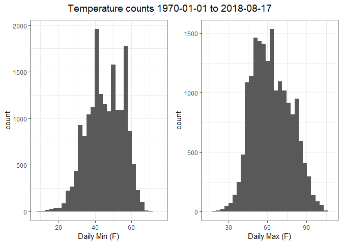
Quick visualizations
I’m familiar with this data from having used it in a different data analysis project, so I’ll briefly visualize the data instead of doing an in-depth exploratory analysis. The summary above showed no missing values for date or temperature. The dataset temperatures are in Fahrenheit degrees. One consideration is that the Fahrenheit scale is an interval scale rather than a ratio scale (e.g., 60 degrees Fahrenheit is not twice as hot as 30 degrees). As I’m using the temperatures only for simple addition and subtraction, I don’t need to worry about converting to a ratio scale (like Kelvin degrees).
min <- ggplot(weather_data, aes(Min)) +
  geom_histogram() +
  theme_bw() +
  labs(x = "Daily Min (F)")

max <- ggplot(weather_data, aes(Max)) +
  geom_histogram() +
  theme_bw() +
  labs(x = "Daily Max (F)")


min + max + # syntax from library patchwork
  plot_annotation("Temperature counts 1970-01-01 to 2018-08-17 ",
                  theme = theme(plot.title = element_text(hjust = 0.5, size = 14)))
Cooling degrees summarized
One way to calculate the total day’s hotness is via heating and cooling degree days, based on a standard for how much buildings need to be heated or cooled. Since the building I work in doesn’t have air conditioning (we instead rely on several standing fans), this seems an appropriate measure of the weather I’ve experienced. According to the weather.gov service from the NOAA:
Degree days are the difference between the daily temperature mean, (high temperature plus low temperature divided by two) and 65°F. If the temperature mean is above 65°F, we subtract 65 from the mean and the result is Cooling Degree Days. If the temperature mean is below 65°F, we subtract the mean from 65 and the result is Heating Degree Days.
Hot days therefore represent cooling days (and cold days represent heating days), and the cumulative sum of the cooling days in a summer approximates the integral of the total heat experienced that season (i.e. how hot it feels).
Below, I calculate the mean and the cooling or heating degree days for that date. With these degree days calculated, I can group by year and calculate the total (cumulative sum) cooling days for each of the last ~50 summers. To be able to compare dates across years, I create another variable for the fractional representation of the year. For example, the decimal representation of July 1st is 2017.496 for 2017 and 2018.496 for 2018. I can then strip the year from those values and compare (and plot) them directly.
degree_days <- weather_data %>%
  mutate(Year = year(Date),
         Month = month(Date),
         Day = day(Date)) %>%
  filter(Year >= 1970 & Month >= 6 & Month <= 8) %>% # Summer months of the last ~50 years
  mutate(DecimalDate = decimal_date(Date), # Each date becomes a fractional year, e.g. 2018-07-01 == 2018.496
         DatePlot = DecimalDate - floor(DecimalDate), # Then I subtract the year to leave only e.g. 0.496
         Decade = 10 * DecimalDate %/% 10, # This gets me the decade: 1970s, 1980s, etc.

         Mean = (Max + Min)/2,
         Heating = ifelse(Mean - 65 <= 0, 65 - Mean, 0),
         Cooling = ifelse(Mean - 65 >= 0, Mean - 65, 0)) %>%
  group_by(Year) %>%
  mutate(HeatingSum = cumsum(Heating),
         CoolingSum = cumsum(Cooling)) %>%
  ungroup()
Multi-year comparisons
With these cumulative sums, I can plot the years and compare them.
ggplot(degree_days, aes(DatePlot, CoolingSum, group = Year, color = as.factor(Decade))) +
  theme_bw() +
  geom_line(size = 3, alpha = 0.6) +
  labs(x = "Fractional Year",
       y = "Cumulative Cooling Days",
       color = "Decade")
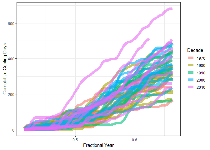
Generally, we can see that the 2010s have been the hottest years. The hottest year is 2015, while 2018 (still in progress) is the second hottest. So as we can see, though 2018 has been a hot year, it has not actually been as hot as 2015 was.
Comparing summers 2015 and 2018
We can compare the two summers head-to-head:
degree_days %>%
  filter(Year %in% c(2015, 2018)) %>%
  ggplot(aes(DatePlot, CoolingSum, color = as.factor(Year))) +
  geom_line(size = 3, alpha = 0.9) +
  scale_color_manual(values = c("#be1e2d", "#2c6087")) +
  theme_bw() +
  labs(x = "Fractional Year",
       y = "Cumulative Cooling Days",
       color = "Year")
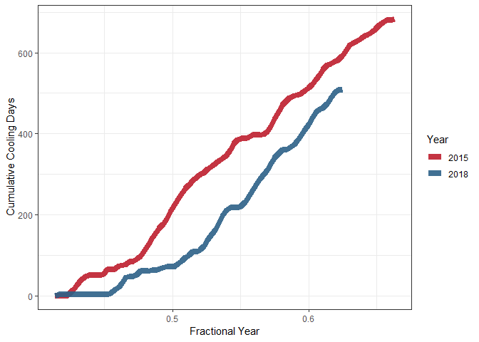
It looks like June 2015 was generally hotter than this year has been to date, though we’ve decreased the gap since July 1st (Fractional year: 0.4958904). We can look at just June and August heat:
degree_days %>%
  filter(Year %in% c(2015, 2018) &
         Month >= 7) %>%
  group_by(Year) %>%
  mutate(CoolingSum = CoolingSum - CoolingSum[1]) %>% # Since we grouped by year,
  # this starts the CoolingSum for 2015 and 2018 at 0 on July 1st instead of the value from June 1st,
  # and subtracts that value from the entire data span.
  ungroup() %>%
  ggplot(aes(DatePlot, CoolingSum, color = as.factor(Year))) +
  geom_line(size = 3, alpha = 0.9) +
  scale_color_manual(values = c("#be1e2d", "#2c6087")) +
  theme_bw() +
  labs(x = "Fractional Year",
       y = "Cumulative Cooling Days",
       color = "Year")
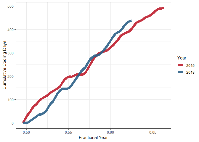
We’ve had a hotter summer if we start counting on July 1st. All of August has been hotter so far too (Fractional Year dates 0.5808219 - 0.6246575).
Conclusion
Summer 2018 has been a hot one for sure – and I’ve felt that heat working in front of a fan every day. Though we’ve hit 90 degrees a record-breaking 30 times this summer in Portland, the total heat – measured as cumulative cooling days – hasn’t quite stacked up. August this year has been hotter than August 2015, but overall summer of 2015 was hotter than this year’s.